


|
|
Alias | Wavefront
110 Richmond Street East
Toronto, Canada, M5C 1P1
{gordo, gf, tbaudel, buxton}@aw.sgi.com
1+ 416 362-9181
An experimental GUI paradigm is presented which is based on the design goals of maximizing the amount of screen used for application data, reducing the amount that the UI diverts visual attentions from the application data, and increasing the quality of input. In pursuit of these goals, we integrated the non-standard UI technologies of multi-sensor tablets, toolglass, transparent UI components, and marking menus. We describe a working prototype of our new paradigm, the rationale behind it and our experiences introducing it into an existing application. Finally, we presents some of the lessons learned: prototypes are useful to break the barriers imposed by conventional GUI design and some of their ideas can still be retrofitted seamlessly into products. Furthermore, the added functionality is not measured only in terms of user performance, but also by the quality of interaction, which allows artists to create new graphic vocabularies and graphic styles.
The basic components of a GUI reflect the characteristics or subtasks of a user's workflow. For example, in the drawing domain, original interfaces like MacPaint have UI components like a tool palette and scrollable drawing surface. This roughly reflects the way an artist would work with pencils and paper. The user moves between the palette and drawing surface, drawing and changing their focus of attention (navigating) to different portions of the drawing. Since selection from the tool palette, drawing and navigation are frequent tasks, GUI designers make these functions readily accessible generally by constantly displaying the UI widgets for these functions.
While this design approach has been very successful it does create some design tensions. First, it introduces a competition for screen space between the UI widgets and the user's art work (Figure 1). Second, it produces a dichotomy between UI widgets and the artwork where a large majority of the UI widgets exist around the edge of the artwork. The first design tension could be addressed by a larger screen with the cost being the expense of a larger display. However, as screen size increases the second design tension becomes a problem. As the screen and artwork become larger the distance a user must travel to/from a tool palette or menu increases. This results in longer task times. Furthermore, a user's focus of attention must constantly change from some point on the artwork to a UI widget at the edge of the screen and then refocus on the artwork again. Dividing attention in this manner requires additional time to reacquire the context and can also result in users missing some message from the system or some change in the artwork performed by the system. We believe that this divided attention problem significantly affects the quality of a user's interaction(1).

Figure 1: A popular word processor with most toolbars turned on(this is the default
configuration). Note that only nine lines of text can be displayed on 800x600screen.
In addition to these design goals we also wanted to address the issue of the quality of input in a traditional GUI. Original GUIs such as the Xerox Star and the Macintosh assumed the mouse and keyboard to be the basic input devices. A huge amount of the power of the traditional GUI comes from the fact that the mouse allows continuous 2 dimensional input from one of the user's hands. We were interested in how providing continuous input for the other hand would improve or affect the design of a GUI.
In this paper we describe an experimental GUI which attempts to address these issues. We designed a GUI paradigm (model of interaction) with the following design goals:
Artwork: Maximize the amount of screen used for artwork
Focus: Avoid forcing the user to divert their visual attention from the artwork
Input: Increase the degrees of manipulation and comfort of input.
These goals have driven much of the recent research in the areas of two-handed input [3, 8, 9, 11], toolglass[2], transparency[7], marking menus[10], graspable UI [5] and multi-sensor tablets. The work described in this paper is a first attempt to integrate this research into single (albeit prototype) application.
For the remainder of this paper we describe and analyze our prototype GUI called T3. This name is derived from the fact that the three major technologies used in our system start with the letter "T" (tablets, two-hands, and transparency) and thus we refer to our system as T3. We provide an overview of the prototype's application functionality and discuss how the combination of the technologies and design concepts contribute to our three design goals. We conclude the paper by describing our experiences introducing the paradigm into a full-featured professional graphics application.
T3 allows simple 2D graphics to be created and edited such as circles, rectangles, triangles and polylines. Figure 2 shows the screen of T3 and some simple graphics. Our goal was not to produce a full featured drawing program but rather to provide enough functions to "outline" the experimental paradigm. Many standard GUI features such as object handles and a multiple selections mechanism were left out. There were two rationales for leaving out some obvious features. For some features, like selection handles, we saw no problem using current GUI paradigms. For other features, however, it wasn't clear how to fit them into the paradigm. These were left for future research. These issues will be further discussed in the following sections.
Figure 2: A screen shot of the prototype of the T3 paradigm. All commands are located
in the toolglass whick is shown overlapping some simple artwork. The cursor
to the right of the toolglass. The screen resolution is 1280x1040
One Button Rotation-Sensitive Pucks and Tablets. We chose to use two customized Wacom puck devices (one per hand) for our input devices which contributes to our Input design goal. The input devices used are shown in Figure 3. The pucks used on both tablets sense both x and y position and rotation. While Figure 3 shows two tablets, ideally, we would have liked to use a single tablet but this was not technically possible without sacrificing sensing rotation.

Figure 3: The input in T3. Two tablets with two rotation sensing pucks. A pen shown
on th right can also be used instead of a puck. Just above the pen is a
device called a "flipbrick."
Although the pucks we used for T3 have four buttons on each we decided our paradigm would be based on a single button on each puck. We choose this simplification because it makes explaining and learning the fundamental mapping of input device states to function simple. Using two buttons results in only four different possible combinations of button state. The intention was that a limited number of button states would allow a user to quickly try all combinations when exploring the interface. If we had used two buttons on each puck this would have resulted in sixteen states. In this case, learning and trying all combinations of buttons would take a long time.
As mentioned previously, T3's pucks also sense rotation. We chose to sense this degree of freedom for several reasons. First, two dimensional rotation of artwork and objects in the artwork was a very desirable function. Second, the hand grasp required to hold a puck affords rotation.
Another motivation for choosing one button per hand was that we wanted it to be possible to substitute a stylus for the dominant hand puck. In this situation, pressure on the stylus tip triggers the button press function. A stylus is especially effective if the artist is performing a freehand drawing. Thus in T3, if the artist desires they can remove the dominant hand puck from the tablet and replace it with an stylus. Note that technically, a stylus can be built to sense rotation, but doing this was beyond the resources of our project.
Fundamental Input Device Mappings For every interaction in the application we try to utilize two-handed techniques which reflect how analogous tasks are perform in the everyday world. The roles of the two hands reflect the asymmetric dominant/non-dominant (D/ND) roles of our hands characterized by Guiard [6]. This will be discussed in more detail later. First we describe how the input devices control the interface.
Each puck has one button and this results in four binary states which map to four general behaviors:
00: No buttons pressed: D puck moves cursor, ND puck moves a toolglass palette.
01: D button pressed only: as in current GUIs the cursor drags objects or carries out the function of the current tool.
10: ND button pressed only: the artwork pans according to the movement of the non-dominate puck.
11: Both buttons pressed: the artwork zooms in/out according to the movement of the pucks relative to one another. The metaphor is stretching the artwork by pulling it apart by grabbing two locations. (zooming out is compressing the artwork by pushing the two locations together).
Sensing rotation allows addition functions simultaneously in each of these states:
00: No buttons pressed: The cursor and toolglass rotate according to the rotation of the pucks.
01: D button pressed only: object being dragged can be simultaneously rotate about the drag point. The current tool can utilize the rotation as a tool parameter.
10: ND button pressed only: rotating the ND puck rotates the artwork about the center of the drag point.
11: Both buttons pressed: puck rotation not used.
In contrast to most traditional GUI designs, we have no statically displayed user interface control widgets. This means we do not have scrollbars or a menu bar. The net result is we are able to maximize the display space for artwork instead of using the space for control widgets. In replacement, we have a single, mobile tool palette based on the toolglass design [2].
As mentioned previously, when the ND button is not pressed a ToolGlass tracks the ND puck. In effect a user has a toolglass "in their hand" when they are not orienting the artwork.
Moving the ToolGlass. Having the ToolGlass follow the ND puck by in this manner contributes to our Input design goal. Because humans are very skilled at having the one hand follow or stay close by the other hand, this skill transfers very effectively in T3. It is very easy to keep the ToolGlass always close to the cursor (which is being controlled by the D puck). An artist does not have to constantly "pick-up, move, and put-down" the tool palette as required by traditional floating tool palettes.
Having the ToolGlass constantly track the ND puck also contributes to our Artwork and Focus design goals. The ToolGlass can easily be moved away so it does not interfere with the artist viewing the artwork, thus in effect maximizing the artwork. Since the user can move the ToolGlass without having to look at it, focus on the artwork can also be maintained.
One of the key features of the toolglass paradigm is the ability to "click thru" toolglass button (for example, an object's color can be changed by clicking the cursor over the red color button when the cursor is also over the object). "Clicking thru" requires the "click thru" types of buttons in a ToolGlass to be transparent (since it is important to see what the click thru will be applied to). T3's ToolGlass is transparent for this reason. However, transparency also contributes to the Artwork and Focus goals. Since the ToolGlass is transparent, even when it is over the artwork, some of the artwork under the toolglass is still visible. This in turn contributes to the Focus design goal since even if the toolglass is covering the desired area of focus in the artwork the user can still maintain their focus because some of the artwork is still visible beneath the ToolGlass.
Transparency is not only used in the Toolglass, but also for prototype shapes, and the click-hold cursor, described in the next sections.
Objects are created in T3 using a two-handed technique we call "two handed stretchies" which works as follows. The artist moves the cursor over the ToolGlass button for the desired object type (for example, the rectangle object in the ToolGlass in Figure 4). The D button is then pressed. The system immediately hides the ToolGlass. When the artist drags the D puck a rectangle is swept out in the conventional way, from the corner. Since the ND hand is free (the toolglass being hidden), we can use it in the transaction, as well. Thus, moving the ND puck stretches the rectangle from the corner diagonally opposite to the corner which is attached to the D puck. In effect, the artist has a hold of both corners of the rectangle and this allows them to translate, rotate and scale all at the same time. When the D button is released, the object is created and "dropped" on top of the artwork. Lines, circles and rectangles can be created with this technique.

Figure 4: Close is a toolglass palette and cursor in T3
Two-handed Stretchies contribute to the Input design goal by providing simultaneous control of translation, scale and rotation of an object. Tasks like positioning and scaling a circle to fit inside a box are substantially easier when controlling both properties simultaneously. We have also found the it allows artist to explore different placements, sizes and rotations of objects more easily.
The two handed stretch interaction also supports our Artwork goal. First, hiding the ToolGlass while the artist is stretching the object helps display more artwork and allows the artist to position an object without the ToolGlass interfering with the overall appearance of the art. Second, when an object is being created (before the artist releases the D button) the object is transparent (when the button is released the object is created in the current color). Like the use of transparency in the ToolGlass, transparent prototypes contribute to our Artwork goal.
Moving Artwork Objects. In T3 the D puck also senses rotation. This allows us to extend the GUI concept of dragging. Not only can objects be translated in two dimensions but they can simultaneously be rotated. Furthermore, the pivot point of the rotation is defined by the point at which the drag started. Because this mapping corresponds so closely to everyday manipulation of objects, adding three addition parameters to dragging (rotation angle and x, y rotation point) is almost instantly learned. We believe that no longer having to break these operations into discrete steps (move, specific pivot point, and rotate) contributes to our Input goal and reflects the notion of phrasing and chunking interactions [4].
Our Artwork and Focus goals are also contributed to by this design. In particular, rotation and setting the pivot point require no graphical objects, so screen space for artwork is conserved and in turn focus on the artwork is maintained since the user does not have to go to a graphical widget or menu item to invoked these functions.
In T3 we were concerned about supporting applications with many functions. For example, PowerAnimator by Alias | Wavefront, which is a professional 3D computer animation package has approximately 400 commands. Roughly speaking, this means that we would have to fill our ToolGlass with 400 elements. Clearly this is not possible or desirable. What is desirable is some way of displaying only a small set of commands but allowing the user quick access to the undisplayed commands.
We accomplish this by embedding a hierarchic marking menu [10] in the top of the ToolGlass palette which allows the user to select among a set of possible toolglass "sheets" (see Figure 5). Assuming our tool palette could comfortably contain 10 commands, a two level menu hierarchy with 8 items at each level (a total of 64 items in the menu) would allow access to 64 different ToolGlasses or 640 commands. Clearly, this is in the command count range of large applications like PowerAnimator. Finally, changing sheets can be done quickly by using marking menus' ability to select using quick marks.
Figure 5 shows the marking menu used in T3. Moving the cursor over the "marking menu hotspot" in the ToolGlass and pressing the D button, causes the menu to pop-up. The menu contains the other ToolGlass palettes available in T3 (a total of 6). Changing ToolGlass palettes only requires a quick flip in the direction of the desired toolglass. Currently, the menu is not hierarchic, so only straight line strokes are needed to select different ToolGlass palettes.
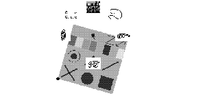
Figure 5: A marking menu to access different toolglass palettes can be popped up
from a hotspot at the top of every toolglass.
This design contributes to all three of our design goals. The Artwork goal is contributed to in several ways. First, using a pop-up menu only temporarily consumes screen space. Also, there is even less impact on artwork if the user performs a selection with a mark rather than by displaying the menu.The menu items are also transparent so the artwork can be seen beneath them. Since the user does not have to go to the edge of the screen to change palettes Focus is maintained. Finally, if the user is familiar with the layout of the menu, they can quickly switch palettes by inputting a mark. This contributes to our Input goal.
The ability to pan and rotate the artwork by pressing and dragging the ND puck is based on our two-handed input design concept described in the introduction. Specifically, the ND positions and orients the artwork while the D hand draws.
This design contributes to our Input goal and there are four issues driving the design. The first issue concerns quick task performance. First, using conventional scrollbars and scroll arrows can be extremely inefficient in that they required the user to move back and forth between the scrollbar and the artwork. Second, orientation of the artwork affects the efficiency of movement. For example, Guiard reports that handwriting is 20% faster if the paper can be manipulated by the ND hand [6].
The second issue concerns comfortable movements. While re-orienting the artwork may sometimes have to do with moving the working area to different (hidden) parts of the artwork, it is also done for comfort reasons. We have observed users moving artwork closer to what they deem is a comfortable work area (e.g., towards the middle of the tablet as opposed to drawing in the upper corner of a tablet).
The third issue concerns quality of movements. We have observed artists rotating the artwork so lines or curves can be drawn with a movement that is easier to perform with the arm. For example, rotation from the elbow affords large smooth curves to be drawn but the resulting curves are horizontal.To use the same technique to create vertical curves relative to the artwork, the artwork is rotated.
The final issue is that the ability to orient the artwork must always be immediately accessible. If the cost of re-orienting the artwork is greater than the cost of working in an uncomfortable position, artists will temporarily work in an uncomfortable position. This is why we dedicated a button to orienting the artwork.
By providing a physical device to control panning we eliminate the need for graphical scrollbars. This contributes to the Artwork goal since standard scroll bars along the side and bottom of the application window consume about 6% of the window's space. Further screen realestate is saved by not requiring graphical gadgets for rotating and zooming the artwork.
The disadvantage is that these features are not self-revealing. That is, there are no graphical elements that suggest and remind the user how to accomplishing scrolling, rotating and zooming. In general, using graphical elements to reveal functionality to the user has been the backbone of the success of GUIs. However, our approach has been, rather than making T3 "walk-up-and-use" we assume that a new user must be given a small amount of instruction to define the "fundamentals" before beginning to operate the interface. The key observation here is that the "fundamentals" then do not have to be self-revealing and hence we can design these interactions to contribute to our three design goals.
Finally, having a physical device to control panning, rotating and zooming the artwork contributes to our Focus goal. The user does not have to divert attention from their artwork to a scroll bar or other graphical widget to pan, rotate or zoom. Visual focus can be (and must be) maintained on the artwork to control the operation.
The T3 prototype supports the notion of curve guides. A curve guide is a tool that emulates the way a ruler, french curve or frisket is used in traditional paper-based illustrations. That is, the curve guide is a "controlling element" or "dynamic constraint" that is mostly managed by the ND device and is used in conjunction with ink generation tools being controlled by the D hand. This two-handed interaction technique facilitates the production of curves.
In T3 we have defined a set of french curves and customized curves that can be used as a curve guide. Each curve resides on a toolglass sheet (see Figure 6) which can be positioned and rotated with the ND device. A scale widget on the toolglass sheet allows the entire sheet (i.e., curve) to be scaled. Note that all three affine transformations (position, rotation and scale) can be performed at the same time. After the toolglass sheet has been positioned, the D device is used to lay down ink by running the ink cursor along the contour of the curve. The inking cursor is automatically snapped to the contour of the curve.
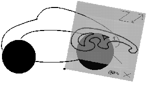
Figure 6: Curve guide on a toolglass sheet
This two-handed interaction technique touches all three design goals. First, the artwork is always visible since the curve guide toolglass sheet is transparent. Secondly, the user's focus can be maintained on the artwork since the tool and artwork can be superimposed. The only diversion occurs when the user must acquire the scale widget on the toolglass sheet. Finally, Translate and rotate operations for the sheet are always available through manipulation of the input device.
Evaluating T3 presents a challenge. Since T3 is a toy application, user testing under more realistic "real work" conditions is not meaningful. However, it is important to note the types of evaluation besides user testing that have already occurred and their value. First, prior to the construction of T3 many of the individual input techniques used in T3 have been empirically evaluated [3, 4, 5, 7, 8, 10, 11] and have shown advantage. Second, artists participated in the design of T3, so user evaluation has been intrinsic in our design process (for example, the ability to directly and fluidly pan/zoom/rotate the artwork is derived directly from artist requests). Third, as UI designers we evaluated the paradigm. For example, can it handle a large number of functions? How much of the interface can be learned by discovery? Are the mapping of input devices to functions consistent, etc.?
User-testing under "real work" conditions would be a critical evaluation of a real application based on T3. However, building a real application from scratch with new technology is a huge task involving significant risk. We have chosen to minimize our risk by incrementally adding T3 features into an existing application and evaluating.
Hence our approach is incremental and iterative (i.e., T3 prototype, portions of T3 into an appropriate existing application and eventually a whole application based on T3). What we describe in the remainder of this paper is the increment from prototype to portions of T3 in a real product. It is also critical to note that the process of trying to integrate portions of T3 into an existing application is in itself a realistic and valuable design evaluation. While this is not a replacement for user testing it is a valuable metric on the road to user testing, and is the subject of the remainder of this paper.
The application chosen was StudioPaint, a high end paint system aimed at replacing paper based illustration in design studios. StudioPaint suited our needs because the focus on quality of interaction is particularly important. Typical users have little or no training with conventional GUIs and are ready to switch back to paper if they feel the product does not suit their needs. StudioPaint also had some interesting features from an experimental point of view. For instance, it had been designed not to use any modal dialogues.
However, integrating T3 functionalities into an existing and widely used program involved compromises. From the technological point of view, some features could not be implemented. For example, it was impossible StudioPaint to rotate the artwork in real time, so we had to drop that functionality rather than providing lower quality interaction. We also couldn't use our custom two tablet configuration. Fortunately, most StudioPaint users have commercially available Wacom tablets. With these we could sense both a puck and pen but rotation was not available.
Finally, the biggest challenge is to provide a smooth transition between the conventional GUI that users already knew and the new T3 paradigm. We had to preserve all the traditional widgets, while allowing the user to evolve toward the T3 paradigm at their own pace. To allow a user to maximize their artwork, UI widgets such as scribblers, menus bars and tool palettes could be removed from the display with a single command selection, and the setup is saved across sessions. Figure 7 presents the typical setup most artists use when drawing with StudioPaint.
In hindsight, these limitations justified the need for our T3 prototype. If we had tried to implement the paradigm in StudioPaint directly, we would have missed exploring some of the paradigm's most powerful and interesting features.

Figure 7: Typical setup for Studiopaint: the usual interactors menus and palettess
are present, but mostly to convey status information. Most of the workspace
is used for the artwork
The control portion of the interface (menus, palettes and scrollbars) had to be replaced by their T3 equivalents. However, we had to make sure we would provide enough functionality right from the beginning for users to accept and evolve towards the proposed workflow. For instance, the ND hand was usually placed on the keyboard to issue hotkey commands. Requiring the same hand to control the puck introduces a competition between the puck and keyboard for the ND hand. The puck will win this competition only if the frequently used commands available from the keyboard are also available from the puck. To accomplish this, we had to make our first compromise: the ND hand device would make use of three buttons instead of one. This worked as follows:
An obvious alternative to additional puck buttons would be a toolglass sheet to replace keyboard commands. However, a combination of problems discouraged us from implementing toolglass sheets:
Our implementation of curve guides in StudioPaint is much more sophisticated than in T3. StudioPaint curve guides are called "sweeps" which is a term used in design studios. The sweeps in StudioPaint can be created with the set of standard drawing tools, similar to a MacDraw editor. The user can create and editing shapes like rectangles, splines and ellipses and then transform these shapes into sweeps. Like the T3's curves guides, a sweep becomes attached to the ND hand and can be moved around on the artwork. However, it cannot be rotated. To compensate for this sweeps have manipulation handles (see figure 8). When the D hand grabs a handle of a "sweep", two opposite corners of the bounding box for the sweep become attached to either hand, and the user can move, scale and rotate these shapes with a "two-handed stretchies" style of interaction.

Figure 8: A curve guide in StudioPaint. The four handles in each corner allow the
guide to be scaled and rotated. Like T3, there is a hotspot for a mariking
menu (shown poppedup).
Snapping Sweeps. Like in T3, sweeps can be used to control precisely the path of the ink while brushing freely along a curve. When used with varying thickness or opacity brushes, this allows the artist to give a more lively character to their drawing, while "snapping" to very precise outlines (see Figure 9). Finally, Sweeps can be stored on StudioPaint's shelf, allowing the user to build their own sets of reference curves.

Figure 9: Brushng along a curve guide. The spline above the car was placed along the
upper edge of the car and used to trace along the guide, with repeated,
varying width brush strokes
Masking Sweeps. Sweeps can also be used as a moving mask which artists commonly refer to as a "frisket". Artist report seldom using a real airbrush without some sort of mask that allows them to produce "sharp edge" effects. The "frisket" is usually held in the ND hand, and moved freely to block the spray paint from the paper. This is used to create various graphic effects (see Figure 10). Other paint programs, like Photoshop, usually provide these masking features, but because they make use of only one continuous input device, they can't provide the seamless interaction available with paper-based tools. StudioPaint's sweeps, however, begin to emulate the fluidity and spontaneity of real airbrushes.
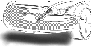
Figure 10: A masking sweep. An airbrush applied with the french curve masking the bumpers
of the car, Note the "hard edge" effect produced by the mask.
Combination Sweeps Finally, the combination of both snapping and masking introduces novel graphical effects that cannot be produced with paper based illustration, and would have been previously tedious to achieve with a paint program. As shown in Figure 11, a hard edge can be drawn easily along a smooth predefined path, to produce a glowing effect. These would have required multiple masking effects, and cautious stroking if sweeps were not available. However, one simple stroke is required when using a sweep.
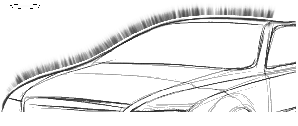
Figure 11: Brushing along a curve with a mask set up: the reulting effect, that of
a "hard edge" effect is produced by the mask.
Marking Menus. Like T3, sweeps have a marking menu embedded in a hot spot at the top center of the sweep's bounding box (see Figure 8). While the marking menu can be used to change to another shape of sweep (like T3), in addition to this it is used for commands that apply to the current sweep. For example, there are menu items to turn masking and snapping on and off, and to copy the currently selected geometry into the sweep. In all, there are 12 menu items that affect the current sweep.
An obvious design alternative would be to have the 12 buttons displayed on the sweep itself instead of 12 menu items. However, there were three major reasons for not doing this. First, adding buttons creates screen clutter. Second, the artist would have to be careful while inking along the sweep not to accidentally click on a button. Finally, since a sweep can be an arbitrary shape, it was complicated to always find a good place to put the buttons.
In T3 we supported both left handed and right handed artists by simply having the user explicitly specify a preference. In StudioPaint we discovered that many times artists work together at the same workstation taking turns working on the artwork. In this case, having to explicitly set the handedness was irritating and quickly fell into not utilizing the ND puck.
To overcome this problem, we developed a method for automatically detecting the handedness of a user and to instantly reconfigure StudioPaint. Because we use a puck and a stylus, relative device positions can be detected and are assigned respectively to the non-dominant and the dominant hand. Then, we can infer the handedness of the user. We use this information to choose where to pop-up palettes or which anchor points to use when doing "two-handed stretchies" editing. Figure 12 shows an example.

Figure 12: The "shell"tool palette is popped nearby the current corsor location when
the user depresses the middle puck button. The palette disapears when the
button is released. Note the implicit of the user's preferred hand.
In T3, we used a separate tablet for each hand. In StudioPaint we used a single tablet and we encountered the problem of the two hands (or the pen and puck) occasionally colliding with one another when drawing along a sweep. To cure this problem, we offset the attachment of the puck to sweep such that the perimeter of the sweep does not overlap the footprint of the puck. Because we can automatically detect handedness, we can intelligently offset the puck. For example, for a right handed person the sweep is offset to the right and above the puck. For a left handed person the sweep is offset above and to the left.
Table 1 shows a summary of how the major features of the T3 paradigm contributed to our three design goals of maximizing the artwork, minimizing diversion of visual focus on the artwork and enhancing the quality of input. In addition it shows how the features were realized in StudioPaint.
| T3 Feature | A | F | I | StudioPaint |
|---|---|---|---|---|
| no peripheral UI widgets | yes | yes | ability to hide shelf, tool bar and scrollbars | |
| drag/rotate objects | yes | yes | yes | drag only |
| ND hand pans/rotates Art | yes | yes | yes | panning only |
| marking menu to change tool palette | yes | yes | yes | on sweeps |
| D/ND hands zooming artwork | yes | yes | yes | no, performance limitation |
| toolglass palettes | yes | yes | sweeps | |
| resizable toolglass | resizable sweeps | |||
| 1 button per hand | yes | 3 buttons on ND hand | ||
| two handed stretches | yes | yes | yes | not used |
| curve guides | yes | yes | sweeps | |
| Tools lock on cursor | yes | already had tool modes | ||
| Transparency | yes | yes | used in sweeps |
In general most features of T3 contribute to all three design goals. We feel this is a result of the general approach of replacing graphical widgets with physical widgets (devices). This, in turn, provides more room for the artwork. Furthermore, if the choice of physical devices is done carefully, the user can operate these devices without having to look at them, thus allowing them to stay focused on the artwork. Finally, if the devices sense manipulations that we are very skilled with, complex manipulations (like simultaneous scaling, translation and rotation) can be performed thus contributing to the quality of input.
T3 is an interesting paradigm not because it provides new functions to users (for example, the ability to scroll and pan artwork is not a new function) but because it provides a higher quality way of performing the functions. This is analogous to the desktop paradigm which didn't provide new functions (for example, the ability to organize files wasn't a new function) but provided a higher quality way of performing those functions. In this paper we have tried to describe what we believe are the design principles contribute to this notion of quality.
Our implementation of T3 into StudioPaint has shown us that providing artists with new ways of interacting with application data (i.e., the sweeps) encourages them to create new graphic vocabularies and styles of illustration. In a sense, by enhancing the UI the functionality of the application becomes enriched.We have already observed this phenomenon in the "Ligne Claire" mark-based spline editing technique [1].
Work continues on the concepts surrounding T3. We are mainly focusing on applying these concepts to other application domains like 3D modelling and computer animation.
We are also beginning to gather usage experiences from automotive graphics artists using StudioPaint and its T3 features. Currently, StudioPaint with T3 features has not yet been released. However, we are already collecting reactions from our beta users. Initial results are encouraging.
We gratefully thank Azuma Murakami and Yasuhiro Fukasaki at Wacom technology for supplying inspirational ideas, tablets, and the custom pucks.
|
|